
Greater Mental Health
of New York
Today. Tomorrow. Together.
Greater Mental Health
of New York
Today. Tomorrow. Together.
Brand Design
Social Toolkit
UI/UX Design
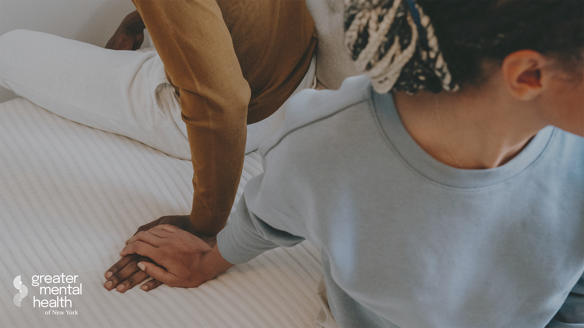
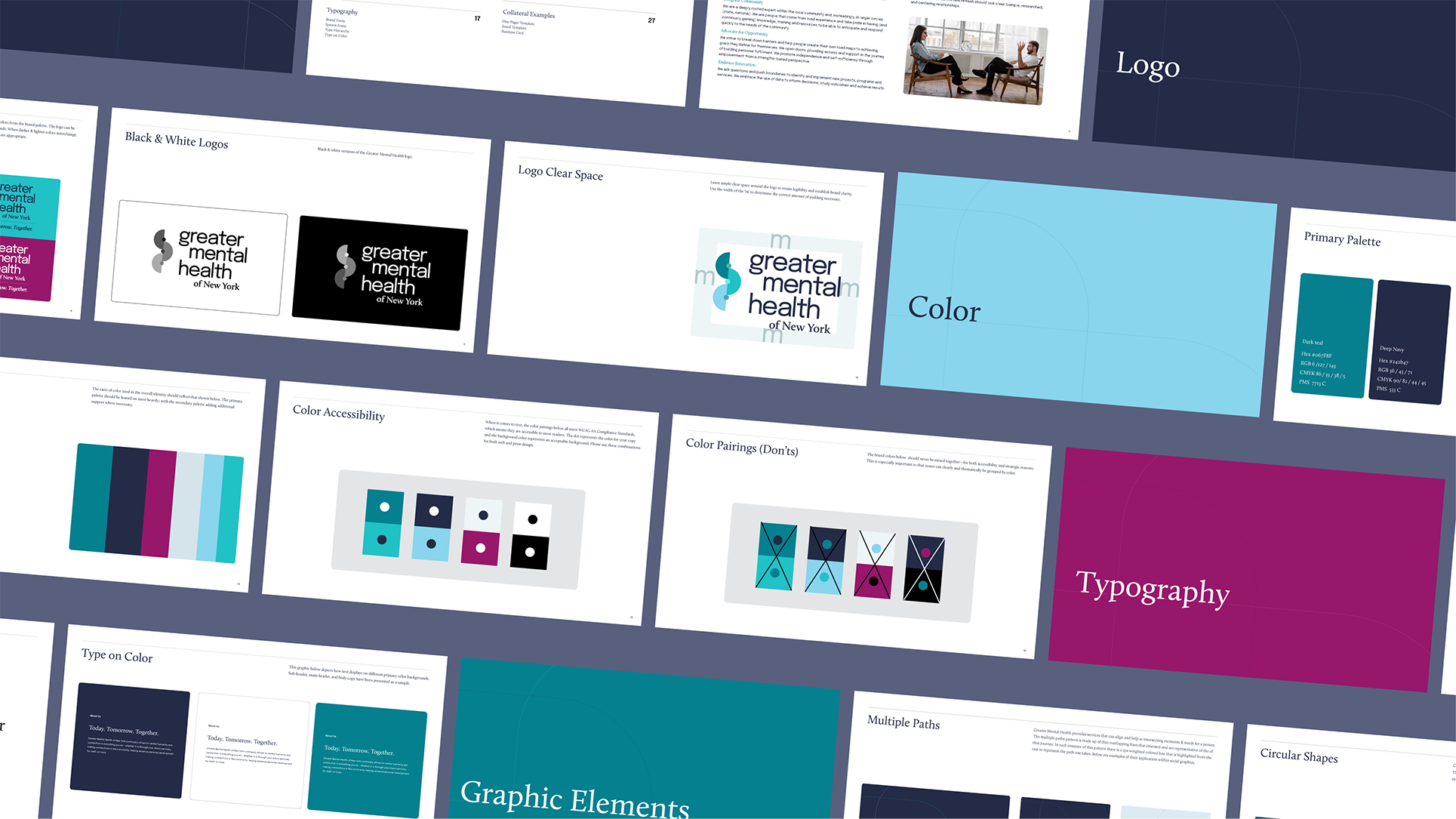
The Greater Mental Health of New York brand refresh needed to clearly convey connection and a journey centered around humanity and individual empowerment. With their constant striving to center humanity and connection in everything they do. It was important that this brand convey this sentiment through all of its materials to those who will utilize them the most, the patients.

The logo icon is an abstract depiction of a winding road or ‘path’ that represents an individual’s personal mental health journey. The dotted points differentiate in hue to symbolize the many different transitions in one’s experiences on the pathway to achieving an improved mental state. The ups, downs, twists, and turns are visually present within the mark as it is present within the mind.


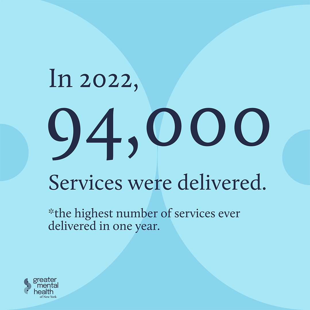


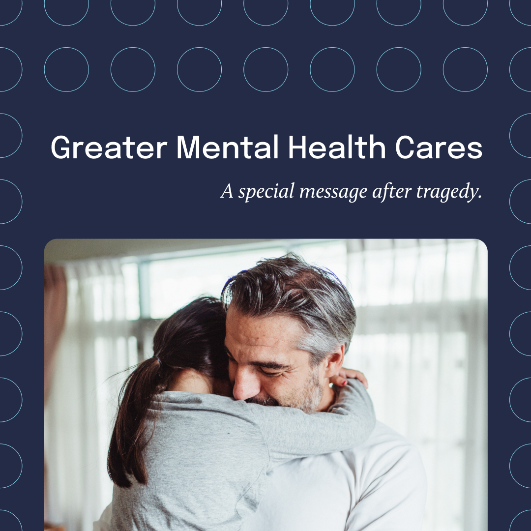
The social toolkit was prepared and equipped with a slew of graphical treatments for different social platforms where MHA spreads awareness and brings light to their events and services. Highlighting patient testimonials and informal graphics backed and anchored by accurate data and facts.

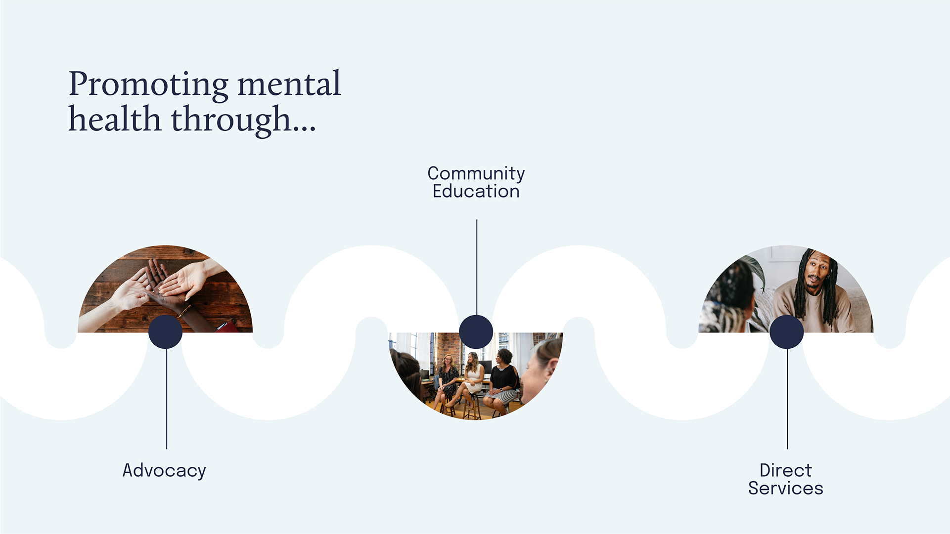
A new website and branding guidelines were created for the refresh. The site transitions seamlessly from desktop to mobile. Utilizing the guidelines as a reference; it utilizes the curated color palette and pattern assets in a well-balanced manner that pairs well with open white space for easy legibility and user experience throughout the site.
Greater Mental Health of New York
Today. Tomorrow. Together.
Greater Mental Health of New York
Today. Tomorrow. Together.

Brand Design
Social Toolkit
UI/UX Design
The Greater Mental Health of New York brand refresh needed to clearly convey connection and a journey centered around humanity and individual empowerment. With their constant striving to center humanity and connection in everything they do. It was important that this brand convey this sentiment through all of its materials to those who will utilize them the most, the patients.


The logo icon is an abstract depiction of a winding road or ‘path’ that represents an individual’s personal mental health journey. The dotted points differentiate in hue to symbolize the many different transitions in one’s experiences on the pathway to achieving an improved mental state. The ups, downs, twists, and turns are visually present within the mark as it is present within the mind.


The social toolkit was prepared and equipped with a slew of graphical treatments for different social platforms where MHA spreads awareness and brings light to their events and services. Highlighting patient testimonials and informal graphics backed and anchored by accurate data and facts.

A new website and branding guidelines were created for the refresh. The site transitions seamlessly from desktop to mobile. Utilizing the guidelines as a reference; it utilizes the curated color palette and pattern assets in a well-balanced manner that pairs well with open white space for easy legibility and user experience throughout the site.
