
Efficiency For Access
Energy access through efficient appliances.
Efficiency For Access
Energy access through efficient appliances.
Brand Design
UX/UI Design
Social Toolkit
Efficiency for Access is a subsidiary of the international NGO CLASP (clasp.ngo). In a global effort, they seek to accelerate clean energy access by means of inclusive appliances that are affordable but high-performing. This new rebrand was built with first creating a new mark, followed by a new palette, website, and visual direction
for social applications.
The logo icon symbolically depicts the letter ‘E’ as in ‘efficiency’ and ‘energy’. Hence, the efficient flow of energy that evolves and empowers these unique appliances. The curvature of the mark also subtly visualizes the appliances efficient functionality.

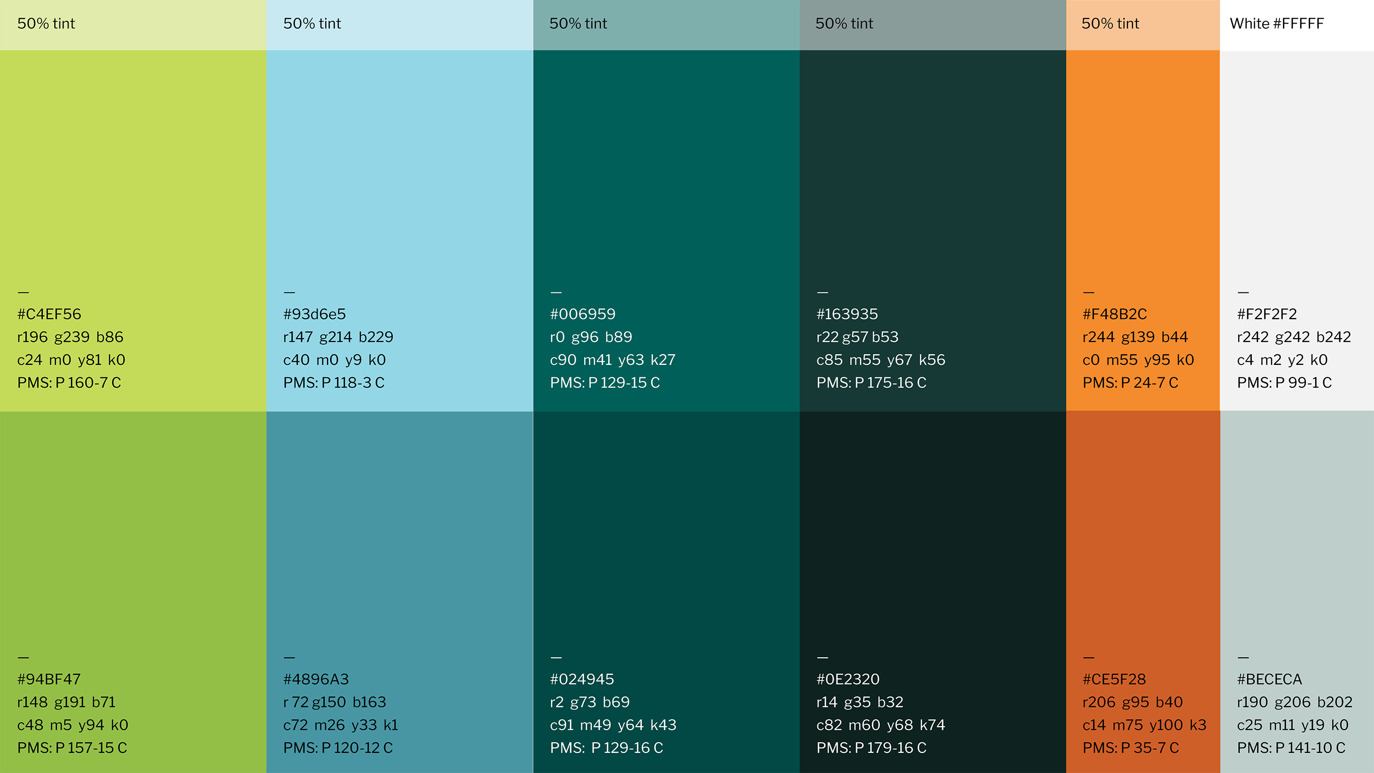
The color palette direction is a take on clean energy and natural elements. The vibrancy and tones utilized complement one another but also represent the overall messaging and impact EforA has made.
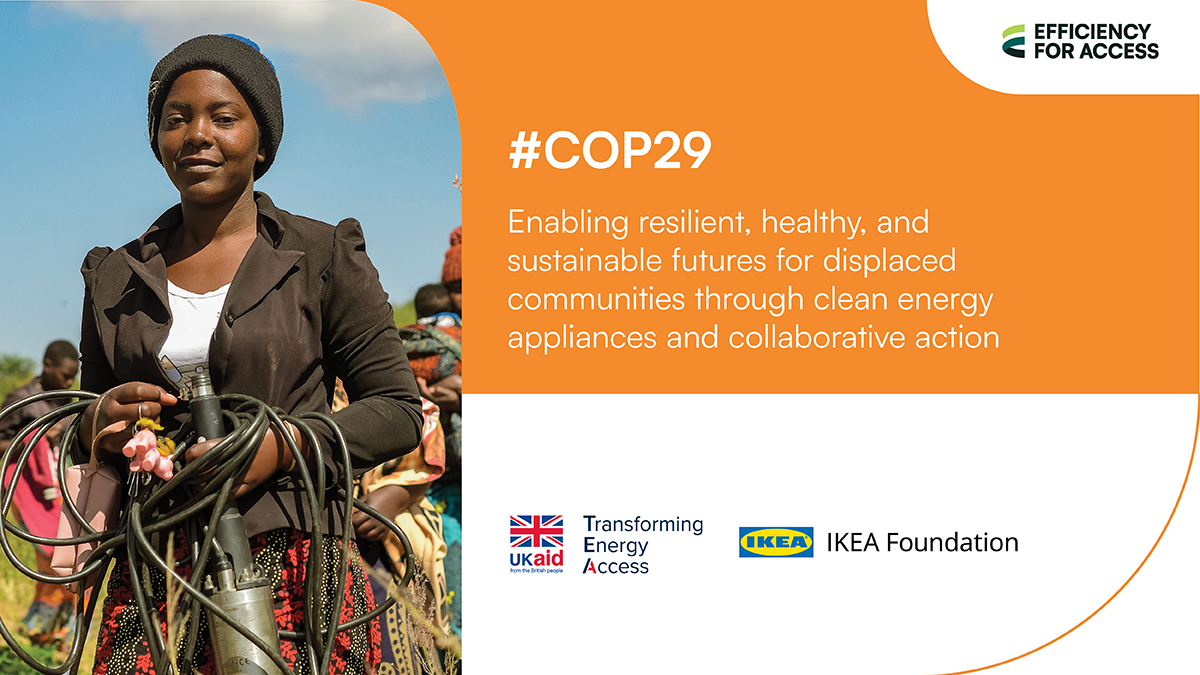


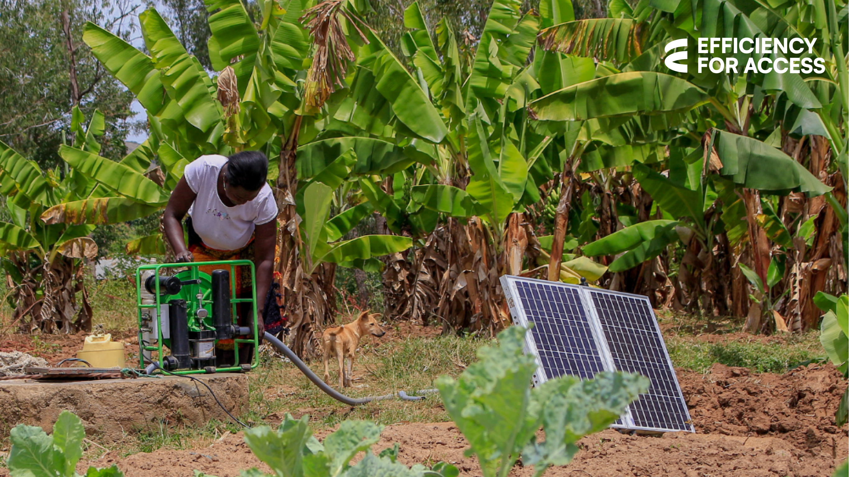
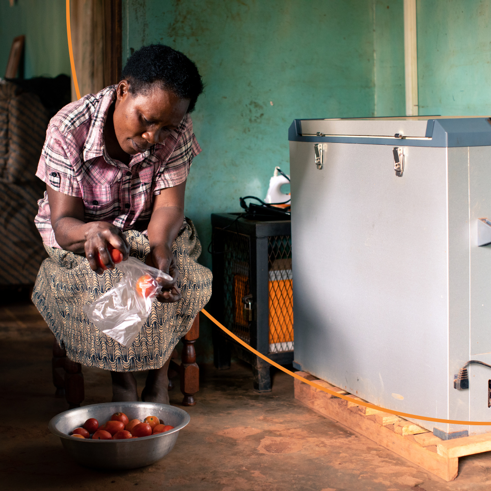
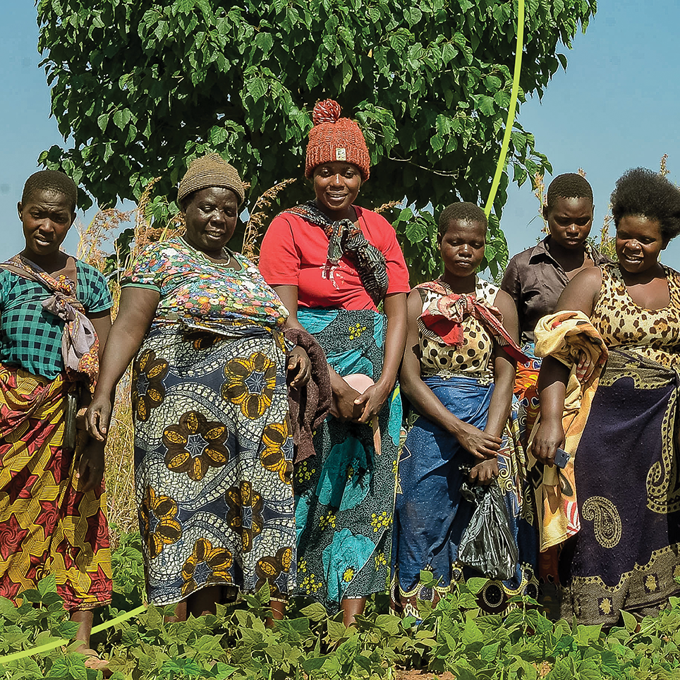
Throughout the social applications and image treatments; the curvature from the logo is expanded throughout the layouts of announcement graphics & informative documents as masking shapes and stylized outlines.


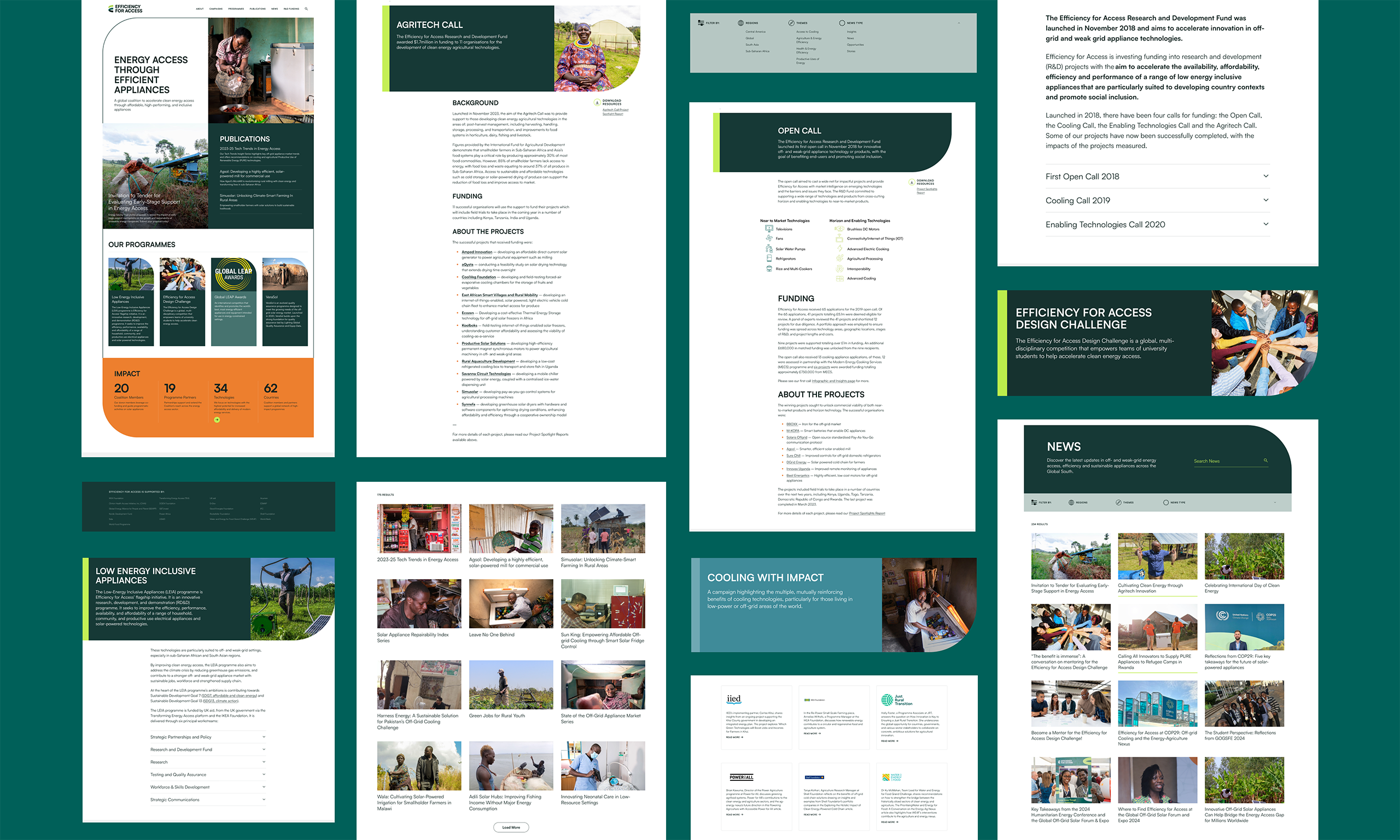
These same branding elements can be seen more vastly throughout the website. Again, utilizing the palette and curvature patterns/shapes bring a dynamic look and feel. Its clean open interface is anchored with the color white which allows for photography and statistics to stand out and serves for high visibility and information digestion.
Efficiency For Access
Energy access through efficient appliances.
Efficiency For Access
Energy access through efficient appliances.

Brand Design
UX/UI Design
Social Toolkit
Efficiency for Access is a subsidiary of the international NGO CLASP (clasp.ngo). In a global effort, they seek to accelerate clean energy access by means of inclusive appliances that are affordable but high-performing. This new rebrand was built with first creating a new mark, followed by a new palette, website, and visual direction for social applications.
The logo icon symbolically depicts the letter ‘E’ as in ‘efficiency’ and ‘energy’. Hence, the efficient flow of energy that evolves and empowers these unique appliances. The curvature of the mark also subtly visualizes the appliances efficient functionality.
The color palette direction is a take on clean energy and natural elements. The vibrancy and tones utilized complement one another but also represent the overall messaging and impact EforA has made.


Throughout the social applications and image treatments; the curvature from the logo is expanded throughout the layouts of announcement graphics & informative documents as masking shapes and stylized outlines.


These same branding elements can be seen more vastly throughout the website. Again, utilizing the palette and curvature patterns/shapes bring a dynamic look and feel. Its clean open interface is anchored with the color white which allows for photography and statistics to stand out and serves for high visibility and information digestion.