Quán Nhii
From Nha Trang to Orange County...
Quán Nhii
From Nha Trang to Orange County...
From Nha Trang to Orange County...

Artistic Direction
Brand Design
Restaurant Identity
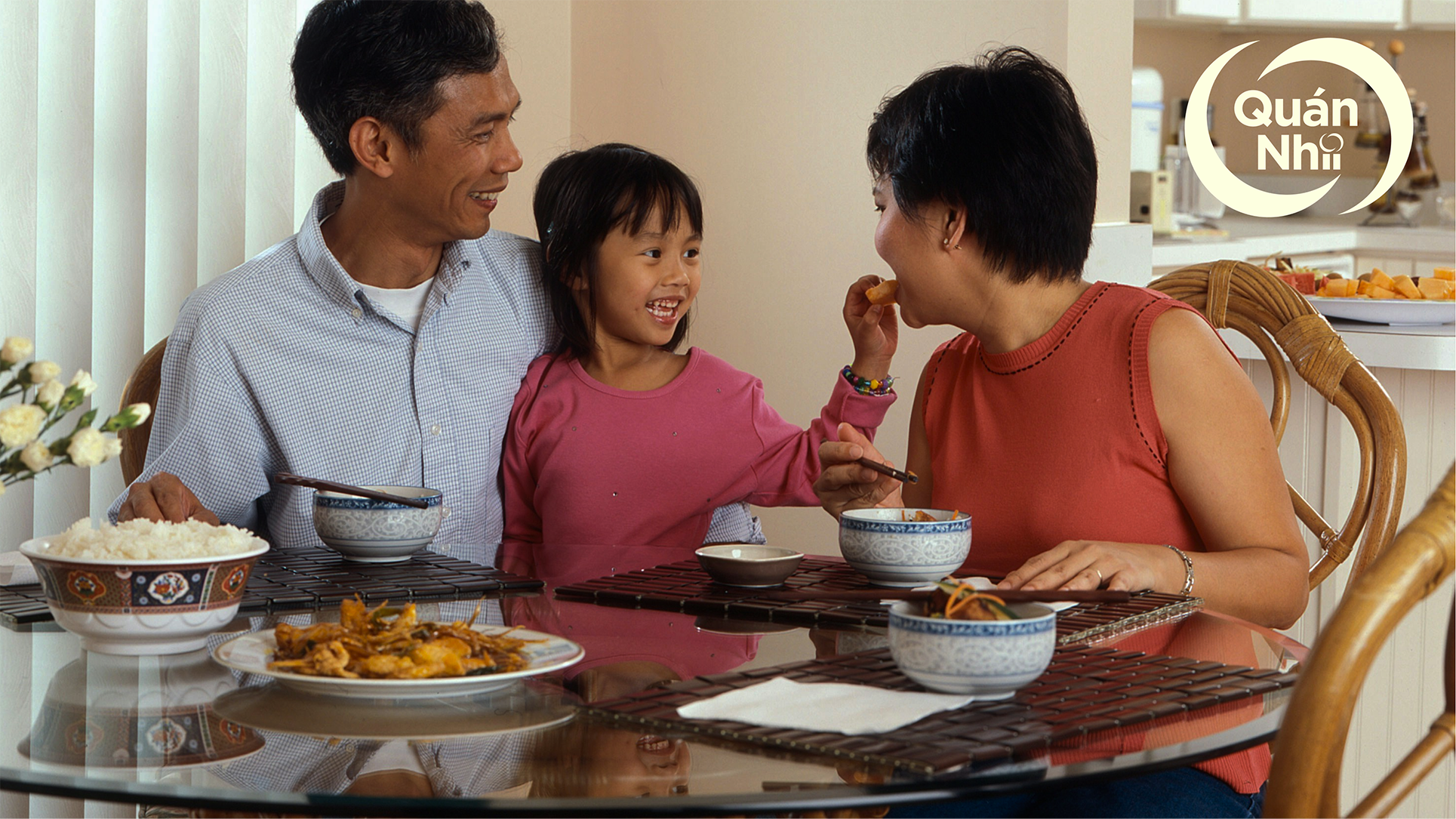
For Quán Nhii, Bánh Uót is a Vietnamese dish and experience that has brought together families, cultures, and traditions. Their goal isn’t to just serve food, but to provide a wholesome dining experience. Ultimately inviting their guests into a story of home, family, community, and culture—a story fellow designer; Jason Liu and myself helped develop through a robust visual identity.
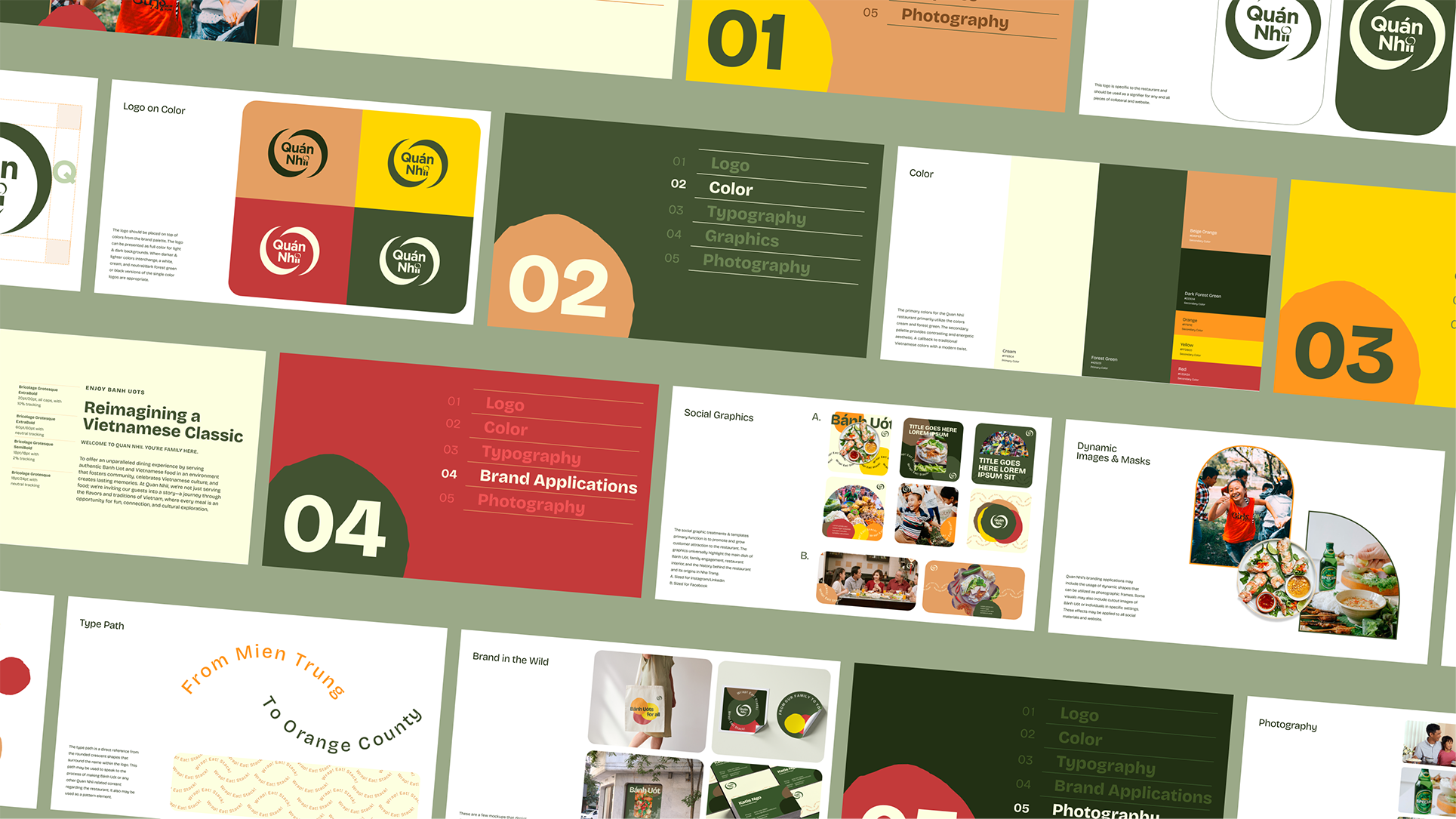
The overall approach to defining the look/feel of the brand ties back to the the owner’s family’s origin and roots in Nha Trang, a small city in Vietnam. The color palette was developed to represent some of the restaurant's core values and traits. The cream & golden yellow to represent joy and royalty, forrest green for nature and fortune, orange for energy & warmth, and red for love and joy.
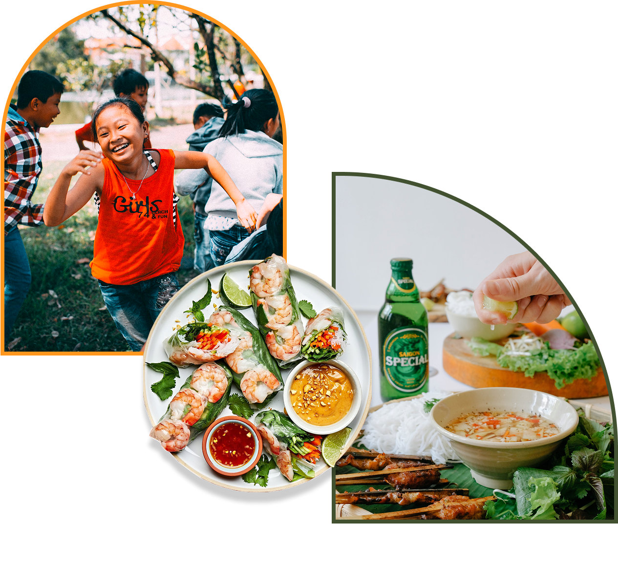
Illustrative elements & unique geometric forms are Inspired by various sources of restaurant interior and decor within the Vietnamese culture. These shapes were used as graphic placeholders for both photos, colors, and various type instances throughout the brand.

With a strong focus in inclusivity, Quán Nhii pride themselves on being a bridge between cultures. Creating a space that appeals to all, regardless of background. They strive to ensure that every guest feels valued and embraced. Making Quán Nhii a haven for not only Vietnamese cuisine enthusiasts but for anyone seeking to broaden their culinary horizons in a friendly and accessible environment.


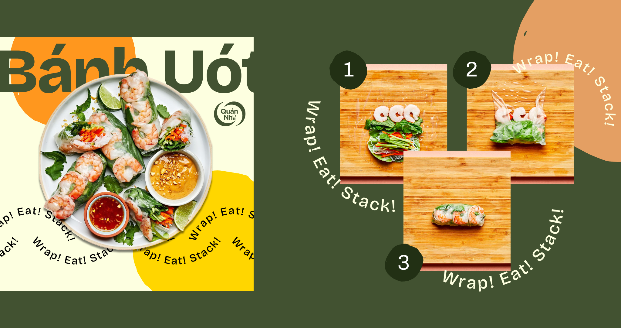
The dish Bánh Uót was the general focus of the visual applications for social media. As it is the staple and anchor to the restaurant’s primary experience and service.
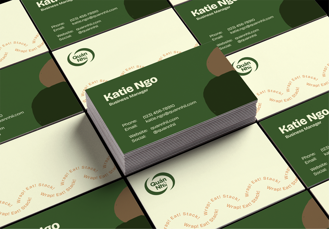
A brand guide was also designed to highlight rules when utilizing the identity within social and print applications for the restaurant and any other collateral that may be created in the future.

Quán Nhii
From Nha Trang to Orange County...
Quán Nhii
From Nha Trang to Orange County...
From Nha Trang to Orange County...
Artistic Direction
Brand Design
Restaurant Identity
For Quán Nhii, Bánh Uót is a Vietnamese dish and experience that has brought together families, cultures, and traditions. Their goal isn’t to just serve food, but to provide a wholesome dining experience. Ultimately inviting their guests into a story of home, family, community, and culture—a story fellow designer; Jason Liu and myself helped develop through a robust visual identity.
The overall approach to defining the look/feel of the brand ties back to the the owner’s family’s origin and roots in Nha Trang, a small city in Vietnam. The color palette was developed to represent some of the restaurant's core values and traits. The cream & golden yellow to represent joy and royalty, forrest green for nature and fortune, orange for energy & warmth, and red for love and joy.
Illustrative elements & unique geometric forms are Inspired by various sources of restaurant interior and decor within the Vietnamese culture. These shapes were used as graphic placeholders for both photos, colors, and various type instances throughout the brand.


With a strong focus in inclusivity, Quán Nhii pride themselves on being a bridge between cultures. Creating a space that appeals to all, regardless of background. They strive to ensure that every guest feels valued and embraced. Making Quán Nhii a haven for not only Vietnamese cuisine enthusiasts but for anyone seeking to broaden their culinary horizons in a friendly and accessible environment.


The dish Bánh Uót was the general focus of the visual applications for social media. As it is the staple and anchor to the restaurant’s primary experience and service.

A brand guide was also designed to highlight rules when utilizing the identity within social and print applications for the restaurant and any other collateral that may be created in the future.