content="Shawn Banks - Illustrator Designer"


The Denver Foundation
A Century of Impact.
A Future of Possibility.


Artistic Direction
Brand Design

Anniversary Campaign


For 100 years, The Denver Foundation has been a leading philanthropic organization, dedicated to creating a strong and thriving Metro Denver, Colorado, and beyond.  While reflecting on the growth over the past century, ushering in a fresh brand identity for the celebration was not only ideal; but also emphasized this important milestone in Denver’s cultural history.


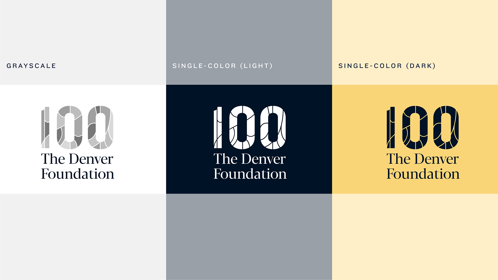
The big ‘100’ stylized with bright colored mosaics show 
a variety of movement and pattern that can grab the attention of the public eye. With the range of colors utilized, the design displays itself as celebratory from look/feel.


The campaign is centered around togetherness and pride within the community. The photography choices generally show grantees and work members of the organization interacting or engaging together as one. Pairs well with the mosaic aesthetic.


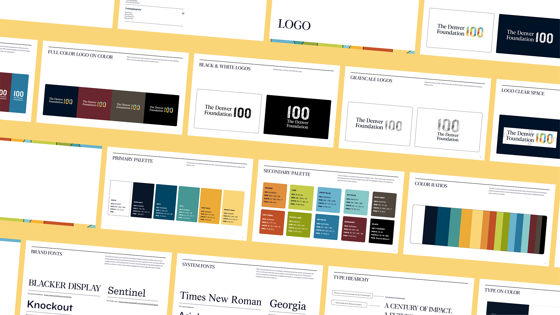
To encapsulate all of these elements, a brand guide was created to highlight all assets and rules when utilizing the design system in social and print applications. 


EdVoice

Changing Policy. Changing Lives.


Brand Design

Social Toolkit

Web Design


The state of California’s educational conditions are divided in two. Children who have access to higher educational quality and children who do not based upon the areas in which they live in. EdVoice’s mission is to create changes in policy to bridge this gap so children in low-income areas may also benefit educationally as well.


The logo icon is the silhouette of a joyful child. This serves as a symbol of hope, while the rays of color protruding from the child represents the diversified voices of these children within these affected areas.


The overall branding package included a new website directed at the insights of the organization, a call-to-action for donations towards EdVoice’s work; along with policy solutions and priorities.

The rebrand also expands across all major social platforms. Completely reshaping the new aesthetic to match the bright and optimistic purpose. Bringing a revitalized sense of legitmacy that can appeal to audiences within the educational space and the policymakers whom EdVoice is targeting and working towards. 

These graphical and web elements were built off the foundational rules of the brand guidelines. Highlighting all colors, patterns, fonts, and photographic directions that can be utilized in a variety of applications.


The Denver Foundation
A Century of Impact.
A Future of Possibility.


Artistic Direction
Brand Design

Anniversary Campaign

For 100 years, The Denver Foundation has been a leading philanthropic organization, dedicated to creating a strong and thriving Metro Denver, Colorado, and beyond.  While reflecting on the growth over the past century, ushering in a fresh brand identity for the celebration was not only ideal; but also emphasized this important milestone in Denver’s cultural history.


The big ‘100’ stylized with bright colored mosaics show 
a variety of movement and pattern that can grab the attention of the public eye. With the range of colors utilized, the design displays itself as celebratory from look/feel.


The campaign is centered around togetherness and pride within the community. The photography choices generally show grantees and work members of the organization interacting or engaging together as one. Pairs well with the mosaic aesthetic.


To encapsulate all of these elements, a brand guide was created to highlight all assets and rules when utilizing the design system in social and print applications.